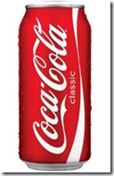
Consumers were confused and complained. They believed the product tasted different than 
There are two interesting packaging lessons:
- Brand logos are not as important as the total color scheme. A brand tends to regard its logo as a standalone item and the background to be of lesser importance. However, logos and words are always far less important than color and designs. Humans recognize and remember shapes and colors far more than words.
- Packaging color and design is such a strong indicator of a product that changing it can actually change taste perception. Many consumers complained that the formula had changed and some even thought that coke and diet coke were being mixed together. Packaging therefore affects taste buds.
Coke’s promotion to help bring attention to polar bears was a great idea, and the retailers thought the white can was innovative and exciting. It’s a hard but valuable lesson in the risk of changing packaging.


1 comment:
At its most basic level, the function of your packaging design is to encourage consumers to find you, choose you over other brands, and decide which of your products is right for them. To do that, it makes sense to adopt brand architecture and semiotics (like icons and imagery) that help consumers navigate and bag your products. Get to know which ones are right for your brand, and work out how to weave them into the design of your pack.
Food Packaging
Post a Comment